Notes about the JPEG formatWhen preparing graphics for the web, it's very important to know how JPEG compression works.Every time you save a JPEG file, your software compresses the image by throwing away data. This is why JPEG is called a "lossy" compression method--you lose data. When you read the file back up, the missing data is simulated, but is not exactly replicated. Each time you resave the file, the process happens again, and each time the image is degraded. Here is an example: I have taken this little image and saved it as a JPEG, then closed it and opened it again, then saved a copy, closed it, and so on until I had opened it and resaved it 4 times. I've used low quality settings to clearly show what happens. Take a look: 1. original  2. open (1) and save as a JEPG...  3. open (2) and save as a JEPG...  4. open (3) and save as a JEPG...  5. open (4) and save as a JEPG... 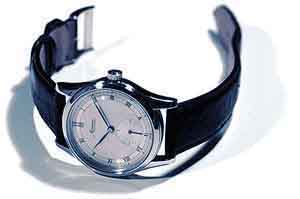 Now look at (1) again: As you can see, the big danger is that the image gradually degrades, and you don't realize it. To make it easy to see what happens to the image, I've taken images (1) and (5), doubled them in size and resaved them as an animated .gif file--watch the graphic below and it will alternate between the two images: 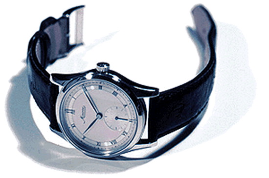 You can see the degradation clearly, especially in areas where there is a lot of contrast--anywhere that there is a sharp edge between a light and dark area. Look how ghost images have formed along the edges of the strap. There is a blocky, hairly look to much of the image, and fine detail has gotten mushy. You should always watch for these artifacts in your images, and learn to see them. Look at edges and small details, especially small white-on-black or black-on-white areas, like dial markings. Here I've done the save exercise with a simple text graphic--on the left is the original, on the right is what it looks like after being resaved four times. Once again, your results will not be this bad if you use higher quality settings, but keep in mind that you're damaging your file every time you do this: Now that you know this, NEVER save your original files in JPEG format without first saving them as something else. Always save your original in Photoshop format, or use a format with "lossless" compression, like TIFF (both JPEG and GIF are lossy). Saving a JPEG should be your very last step, when everything else is done. Always save a copy of your original file, and always go back to this original if you want to make changes, then save a new JPEG copy directly from your original. Look at the images above and note that the worst damage occured the first time the file was resaved. Another thing to consider, is that when you save a JPEG, you can't see the damage to your file until you read it back up again, unless your software provides a JPEG preview. Sometimes, the only original you have is a JPEG from your digital camera. Unless what you get out of the camera is perfect, you're going to need to resave it at least once. If this is the case, use the biggest file size and highest quality settings your camera offers. Open the file and resave it as a Photoshop or TIFF file--you will not degrade the file further as long as you don't resave it as a JPEG. You'll also have better results if you start with a file that's bigger than you need, then reduce its resolution. One last thing--there are several good JPEG utilities available. I use ProJPEG from BoxTop Software. Paul Delury has recommended a PC utility several times--since I'm on a Mac, I can't remember what it is, but he will probably chime in. Using the Levels control in Photoshop First off, you should adjust your monitor so that you can see the whole range of tones in this graphic--you should see a difference between 100 and 90, and between 10 and 0. If your monitor is reasonably accurate, the image below should look really washed out: 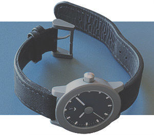 The easiest way to fix this is with the levels control. When you open it, you'll see a "histogram," a chart that shows the distribution of tones in your image: 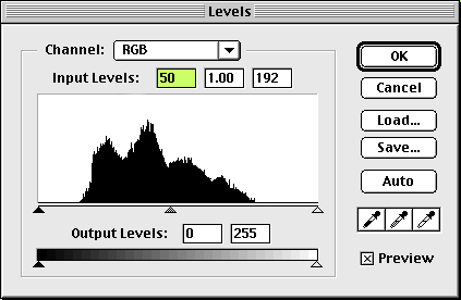 On the left, above the black triangle, is where black would be. On the right, above the white triangle, is where white would be. If you look at the histogram, you can see that the darkest tone in the image is about a 75% gray, and the lightest tone is about 25%. By moving the white and black sliders so that they bracket the histogram, you can shift the shadows towards black, and the highlights towards white: 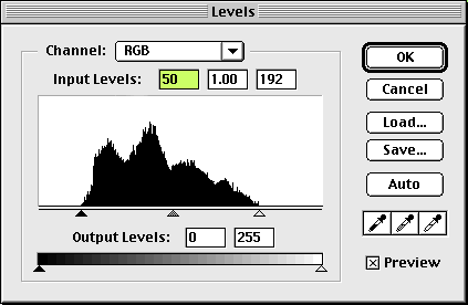 Here is the result of the change above: 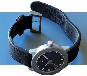 And here is the first one again, for comparison: You should always look at the histogram for your images, and adjust them when necessary so that your blackest black is black, and your whitest white is white, not gray. Otherwise, your image is not using the entire tonal range available--it's too "flat." The histogram can also tell you if the image is over- or under- exposed, and within reason, allow you to fix it. Sharpening in PhotoshopA common misconception about sharpening is that it can make a blurred image sharp. It can't--if an image is blurred, there is not a whole lot you can do about it. What sharpening actually does is increase contrast between pixels. If a light and a dark pixel are next to each other, it makes the light pixel slightly lighter, and the dark one darker. This will bring out fine detail, especially in textures. The image seems to become sharper, but it is actually just a change in contrast between pixels, that brings out details that are already there. Look at this image again:And here it is after sharpening:  Notice how this brings out the texture of the strap, as well as fine details like the minute markers on the dial. Many digital images tend to be "mushy" and sharpening, if used carefully, can improve them considerably. However, if it's overused, or if an image is sharpened and then sharpened again, you often get haloes and jagged edges, and the image can start to look very artificial. This can also bring out some of the nastier JPEG artifacts:  Not every image should be sharpened--it depends on the subject. There also may be things in the image that you do and don't want sharpened--you want to bring out detail, but don't want to bring out grain or noise. If you're working on a portrait, you don't want to sharpen the pores in the person's face. In these cases, use unsharp mask instead--this allows you to control where and how much sharpening takes place. The "threshold" setting controls how many tones apart two pixels must be before they get sharpened. Setting this number higher will prevent ares of less contrast from being sharpened--for instance, you can set it high enough so that a person's skin texture doesn't get sharpened. If working for the web, always set the radius to 1.0 pixels, or you will get haloes or double edges where light and dark areas meet. The amount setting controls how much of a contrast change takes place. Doing a composite with layersBecause you asked, here is how the Zenith title graphic was done: I started with this. The watch is sitting on an empty plastic 35mm film canister, and the camera is tilted: 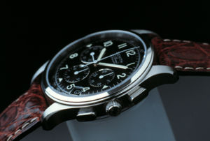 Here is the background image. The lower portion is lightened so that the dark, lower edge of the first image will separate from it: 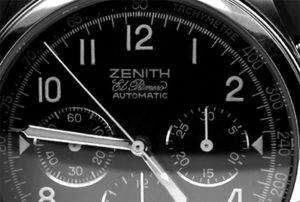 Here is the mask I made to knock out the background out of the first image. The bottom edge is sharp, where the photo is sharp, on the top, where the far edge of the watch is starting to go out-of-focus, the mask is blurred. This avoids the "cut out" look where a soft edge has a hard outline, and also allows the top edge to blend into the background: 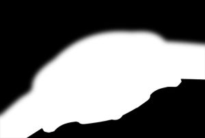 Here is how they all stacked together into one file. The bottom layer is just a solid blue background, the very top layer is the "Zenith class 4" text: 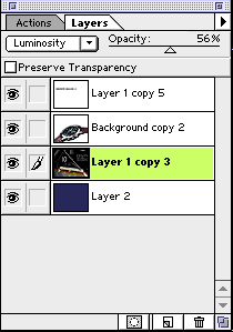 And here' sthe final result again: Hope you find this helpful. |